Author Archive

Aug
02

We just released a new self hosted app you can download and install on your own server, we call it Sendy!

What is Sendy?

Sendy is a self hosted email newsletter application that lets you send trackable emails via Amazon Simple Email Service (SES). Complete with reports, subscriber and list management.

Sendy was born out of frustration of paying for expensive email campaign services. We send newsletters via Campaign Monitor for SUBERNOVA and MockVault. No doubt Campaign Monitor is a great email campaign service, the price goes up to hundreds of dollars just for one email campaign. As our subscriber base grows, the cost per campaign grows significantly high.

We really don’t ask for much, just a newsletter application that enables us to manage subscribers, send campaigns and view reports. What we managed to find were either too expensive or flat out ugly.

The best service we’ve found

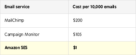
The best service we’ve found is Amazon Simple Email Service (SES). It offers email sending at high deliverability rates and at an insanely low price. $1 (Amazon SES) versus $150 (Campaign Monitor) for 10,000 emails?? Sounds great! But they don’t offer the ability to send trackable newsletters and manage lists and subscribers.

Amazon SES is in need of an application that is built around it.

And so we built it. We even added client access features so that you can create logins for your clients to send newsletters on their own at a price you set.

You can have Sendy too at a one time introductory fee of $40 (we’ll be pricing it at $59 at some point).

Jun
28

Couldn’t have said it better than this video.

Pulling together a bunch of designers or companies to pitch for a web design project may seem like a wise idea but may actually work against you.

Feb
17

We previously talked about our new app, MockVault. It’s now available immediately for signups!

What is MockVault?

MockVault lets you manage your designs and versions with ease at the backend and present them professionally to your clients at the frontend.

To get a design approved, it’s not all about the design, it’s how you sell it. When sending a design to your client over the web, different format yields different results. If you’ve been sending mockups in PDF, Powerpoint or even in multiple JPEGs, your designs may not look like how it should be when it’s coded. This results in unnecessary requests for changes, wasting you time.

For over 13 years, we’ve tried and tested several ways of presenting our designs to clients. Only one format deemed the most effective in terms of getting it approved. It’s by placing annotations over the mockups and displaying it like the actual website.

The reason why annotations raises approval rates is because it’s easy for them to understand what they’re looking at. Guiding your clients through is critical if you want them to see the design the way you see it.

It is difficult to guide your client through your design over the web. With MockVault, it’s easy.

Check out MockVault!

Mar
24

If you are an email marketer or any company wanting to market your products and services through email, read this. Follow every step if you want to annoy users, lose brand equity and sales.

1. Send Permission-less Email Newsletters

All you need to do is obtain email addresses illegally from every website you can find and send your newsletters to them. Let these emails pop up on victim’s mailboxes and send them wondering what they have done to deserve these spams. Put <ADV>  in your subject line and trick them into thinking you’re doing a legal email campaign because users are stupid. They will be happy to read what you have to say and are very likely to buy your product.

2. Don’t Include An Unsubscribe Link

This is a no brainer, if you want users to stay on your mailing list, don’t include an unsubscribe link! Your newsletter’s content is gold, users would love to receive more of them. Why would they click “Report Spam”, bounce or delete your email? Unless they’re not interested in your spam of course! But most users LIKE anonymous newsletters in their busy inboxes so they’re unlikely to mark it as spam.

3. Okay, Include An Unsubscribe Link

But let them surf through 100 pages before they can hit the life saving unsubscribe button. Let them play hide and seek. Let them log in first, even though these users have never signed up before or cannot remember their log in credentials.

Let’s assume they managed to log in to set their newsletters preferences. Disable the “unsubscribe from newsletter” checkboxes so that users cannot uncheck them and unsubscribe! Genius! This is what we learnt from Mocca.com.


4. Don’t Unsubscribe Them Immediately

Fine, after all the thick walls you have put before them, they still manage to unsubscribe. This is the last tactic you can use to continue spamming them dry.

When they hit unsubscribe, tell them that it will take 30 days to take them off the list. The more number of days the better, this is so that you can continue spamming them during these 30 days or more.

See the pattern here? You have time to continue spamming them but have no time to take them off the list. But don’t worry your users aren’t smart enough to notice that this is absurd.

5. Include Everyone’s Email Addresses In The “To: or CC:” Field


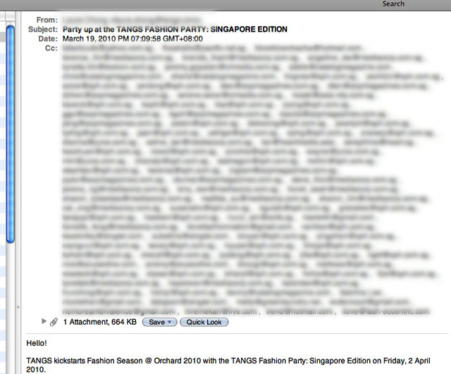
Use your desktop email client like Outlook to send newsletters, and put everyone’s email addresses in the “To: or CC:” field so that everyone else who receive the newsletters can see. Perhaps they can save everyone else’s email addresses so that they can spam each other later, the world needs more spam email newsletters, right?

Conclusion

This is what rogue email marketers do all the time. They are usually engaged by companies wanting to sell their products or services and who are clueless about how to reach out to more people.

As a result, these companies resort to buying email databases sold by companies who collect email addresses all over the internet whether or not they have permission to use them legally for any email campaigns.

With these email addresses, they engage email marketers to do email marketing on them even though none of these poor victims subscribed to these newsletters.

As a result, the rate of users marking these unknown newsletters as spam, unsubscribing, and worse still, hating your brand, is sky high because these email campaigns aren’t targeted at all. They did not sign up for these.

These marketers who think “eventually somebody is going to say yes” are oblivious to the consequences of such email campaigns. Overtime, when more people who aren’t interested gets annoyed about these newsletters and your brand, your company’s reputation naturally goes southwards. Instead of buying from you, they get pissed off and you wonder why they don’t buy from you.

Mar
16

Less than 8% of the people interviewed at Times Square New York know what a browser is.

There’s no surprise that more people around the world, not just Times Square alone, doesn’t know what a browser is, don’t use the internet as much as we would like to think, are less savvy and would get lost if the site is designed to be more complicated than they would have liked.

It’s a good place to start thinking about these users who are going to use the next website you design. Watch the following video and be surprised:

Found at: UX Magazine

Mar
08

We just made a new screencast for SUBERNOVA, quickly demonstrating all the key features that will help people better manage their projects. Check it out (best viewed when played in fullscreen)!


If you haven’t heard of SUBERNOVA, it’s an online project management application (designed and developed by us!) that makes you more productive by taking the stress out of remembering important details of your projects, lets you track time, send invoices and estimates, collaborate with team mates or clients and keeps your business smooth by keeping tabs on late payments, deadlines and more.

Feb
24

This is a human representative of a computer interface. Very well executed. Must watch!


via @adechong

Feb
20

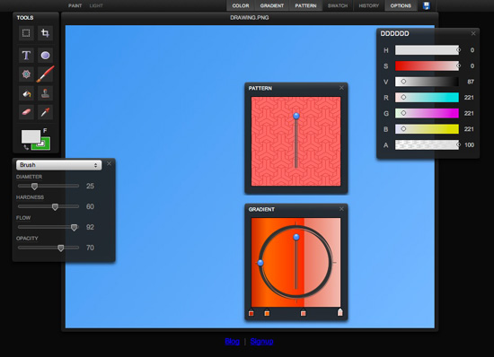
Will HTML5 replace Flash?

I was skeptical at first, until a few experiments with HTML5 pops up across the web that caught my attention.

These experiments looks like they were built with Flash, but they’re not. What’s more, the performance was incredibly better than Flash.

Here’s two awesome examples (note: you need to view them on a modern browser eg. Safari, Firefox, Google Chrome, NOT IE6!):

Sketchpad

Continue Reading

Feb
17


Wired and Adobe working together to create the next generation of magazines. Looking pretty good.

The same high gloss magazines but with interactive elements. What a brand new experience!

Adobe announced that AIR would run on Android, and Adobe has already announced its Packager for iPhone tool that will allow Flash apps (including AIR) to run on Apple mobile platforms.

That is exciting! Can’t wait to leverage our existing AS3 skills to build native mobile apps for iPhone and iPad.

Feb
16


“Social Media isn’t a fad, it’s a fundamental shift in the way we communicate.”.

Awesome video found via Twitip.

Categories

From Twitter